Album 51 Final Cover *spoilers*


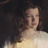
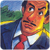
My first thoughts when looking at the final cover were, "I like the drawn version better." I think that both Connie and Eugene looked better with their expressions in the previous sketch we saw. Connie doesn't look too bad, though her eyes are a bit scary. Eugene doesn't really look like himself, in part cause of that pointy chin And it looks strange for his visible eye to have such thick eyelashes (that's a minor quibble, though).
It's not a horrible cover by any means, just quite different from what I was expecting. I'm sure looking forward to the episode in which this scene takes place! On the plus side, I do like Connie's shirt and Eugene's vest.
It's not a horrible cover by any means, just quite different from what I was expecting. I'm sure looking forward to the episode in which this scene takes place! On the plus side, I do like Connie's shirt and Eugene's vest.

-
Trent DeWhite
- Former Mayor
- Posts: 11659
- Joined: April 2005
- Location: Canada
- Contact:
I'd tend to agree with you on that. It's nice when an album cover (such as Days to Remember and even Wish You Were Here, to some extent) is representative of the entire album. To play devil's advocate, though, it's not as easy to do that when there isn't a particular theme running through all twelve shows. I'll agree with you that they could've done a better job on The Big Picture. But I could throw the same argument you used when talking about Journey of Choices. The original album cover showed Whit walking hand-in-hand with some random boy with two winding paths in the background. That was metaphorically representative of the entire album, but it isn't nearly as eye-catching as the new artwork, which is representative of a single episode (Pet Peeves).Bennett wrote:I think I know the problem with many of the recent albums (by the way, I don't hate it...I think it is better than a few others we've had to endure) is that they don't symbolize the most exciting or greatest part of the album. In "The sky's the Limit", how is what Grady's doing really showing ANYTHING of what the album is about, or an important part of the album? "A Date with Dad" shows the same problem. "The Big Picture" shows Mandy and a Tuba instead of the old classic part where whit discovers Novacom? Which one sounds more exciting to you? Even that finger pointing down is a lot more mysterious and exciting. "Hidden Treasures" decreases the excitement of Tom finding Timmy's possession to Tom sulking over Timmy's possession. "Days to Remember's" new album is certainly representative. But who is the black kid on the show? Marvin? Who is he supposed to be? And again, certainly less exciting than Eugene falling off a bridge.
To suggest that "the most exciting thing . . . is the haircut" is a rather hasty assumption, don't you think?Bennett wrote:I congratulate remakes of album "Risks and Rewards" ,"Other times, other places" for at least making an attempt to remain as equally exciting. This is why it's called, "adventures" in odyssey. A haircut is not an adventure. Why buy an album where the most exciting thing in it is the haircut?
You'll remember Eugene's eyes are periwinkle blue from the episode, Truth, Trivia, and Trina.greencardigan wrote:HAHAHAHAHAHAHA!I love this fake album cover. And since when are Eugene's eyes blue? I thought they were brown.

Check out our interview with Paul McCusker, author and director of Darien's Rise!
Exactly what I think. Eugene should not look happy about getting a haircut...the original artwork reminded me of the time Connie tried to use an eyeliner pencil on his mustache.H Tide wrote:My first thoughts when looking at the final cover were, "I like the drawn version better." I think that both Connie and Eugene looked better with their expressions in the previous sketch we saw.

-
Eugene

- Official Brainiac

- Posts: 1416
- Joined: June 2009
- Location: Occupied lands of Canada
- Status: My hair is 🟣; My soul is ☠
- Gender:
- Contact:
Well, Boswell, it depends on how he reacts in the drama.
And I will say again that I like this cover, but there are a few problems with it. And one thing I failed to mention in my earlier post was Eugene's hair colour. Unless it's supposed to be that colour 'cause he dies it in the drama, I think it should be changed back to the more brownie colour.
And I think that the characters need to be moved to the right a slight bit.
I also think that this isn't the final version of the cover art. It's probably going to undergo a few changes between now and it's release.

"Don't fuss with me." WHY;

Initial thoughts: AHHHHHHHHHH!
When I first opened the page, I think I almost died. Eugene's eyes are scary. Then again, both of their faces are pretty scary. It's like... triangles. wut.
Honest opinion: Yech. Worst box cover ever created for an Odyssey album. Perhaps the worst box cover ever.
When I first opened the page, I think I almost died. Eugene's eyes are scary. Then again, both of their faces are pretty scary. It's like... triangles. wut.
Honest opinion: Yech. Worst box cover ever created for an Odyssey album. Perhaps the worst box cover ever.
So you lost your trust,
And you never should have.
No, you never should have.
But don't break your back
If you ever see this,
But don't answer that.
In a bullet proof vest
With the windows all closed,
I'll be doing my best
I'll see you soon.
And you never should have.
No, you never should have.
But don't break your back
If you ever see this,
But don't answer that.
In a bullet proof vest
With the windows all closed,
I'll be doing my best
I'll see you soon.

-
Jacob Isom

- I'm not Gabe
- Posts: 672
- Joined: April 2005
- Location: Ohio
- Contact:
Hey, look at it this way. Maybe they aren't telling us something and this is only a preliminary cover art to submit to distributors on time? You never know!
I don't think it's such a bad cover... just not as everyone was expecting.
I don't think it's such a bad cover... just not as everyone was expecting.

"Providing the Scoop on Adventures in Odyssey, one cone at a time."
http://www.odysseyscoop.com | Personal Site: http://www.jacobisom.org
I can't say that I've been impressed with much of Mr. Locke's work. It seems way too cartoonish for AIO. I'd much prefer faces that look like actual human faces. (Do you guys remember that one art with George Barclay? His mouth was HUGE. It was like the size of a medium-sized child. It was freaky.)
So you lost your trust,
And you never should have.
No, you never should have.
But don't break your back
If you ever see this,
But don't answer that.
In a bullet proof vest
With the windows all closed,
I'll be doing my best
I'll see you soon.
And you never should have.
No, you never should have.
But don't break your back
If you ever see this,
But don't answer that.
In a bullet proof vest
With the windows all closed,
I'll be doing my best
I'll see you soon.

Reminds of me of a funny special feature on Jonah: "Wow, that could be another way into Narnia!"

*CAWWWWWWWWWWWWWWWWWWWWWWWWWWWWWWWWW*
-
King Butter Turtle
- Expecting a battle
- Posts: 4706
- Joined: March 2008
- Location: Marus
- Contact:
A few more thoughts;
First, what happened to Vogel Cuts?
Also, the title graphic is really boring. It's about as eye-catching as a dog in a sweater.
First, what happened to Vogel Cuts?
Also, the title graphic is really boring. It's about as eye-catching as a dog in a sweater.
Lisa Hammit - 1991-2011 - Forever strong in Christ
-
Trent DeWhite
- Former Mayor
- Posts: 11659
- Joined: April 2005
- Location: Canada
- Contact:
I thought the title font looked pretty sharp.King Butter Turtle wrote:Also, the title graphic is really boring. It's about as eye-catching as a dog in a sweater.
Check out our interview with Paul McCusker, author and director of Darien's Rise!
-
Jacob Isom
- I'm not Gabe
- Posts: 672
- Joined: April 2005
- Location: Ohio
- Contact:
Dogs in sweaters are actually VERY eye-catching!King Butter Turtle wrote:A few more thoughts;
First, what happened to Vogel Cuts?
Also, the title graphic is really boring. It's about as eye-catching as a dog in a sweater.
"Providing the Scoop on Adventures in Odyssey, one cone at a time."
http://www.odysseyscoop.com | Personal Site: http://www.jacobisom.org

I totally like Garry's work, and I think its cartoonish style is very suiting for AIO.
However I don't like this album cover at all. Eugene looks... kinda like a girl, actually. ew.
However I don't like this album cover at all. Eugene looks... kinda like a girl, actually. ew.
Fallacy of false continuum. // bookworm
Any cupcake can be made holy through being baptized in the name of the Butter, the Vanilla and the Powdered Sugar. // Kait
Any cupcake can be made holy through being baptized in the name of the Butter, the Vanilla and the Powdered Sugar. // Kait
Maybe Connie's taking his hair to replace her own discoloured ponytail?

Personally my favorite album cover of old was the changing times...now the new one is kinda dorky. >_>
-
Amethystic

- Random Rebel

- Posts: 13261
- Joined: April 2008
- Location: Somewhere between this world and the planet Xoltac.
*eyes start to bleed* NOOOOOOOOOOOOOOOOOOOOOOOOOO!!!! 
I know I am dead; I have seen Eugene's eyes.
 Yeah, Eugene does look like a girl. When I only had the picture partially in the window and I could see Connie's hand right by Eugene's body, it looked like it was Eugene's hand. O_o
I know I am dead; I have seen Eugene's eyes.


-
Samurai Neil

- Popsicle kid
- Posts: 486
- Joined: May 2009
- Location: Exactly where I am!
That. Is. Awesome.Kairi wrote:Reminds of me of a funny special feature on Jonah: "Wow, that could be another way into Narnia!"
Actually, I disagree with the haters and the lovers of the artwork. It's just below par to me.
COMING SOON: RANDOM ECONOMY TEXTBOOK QUOTES


My reaction: 


EDIT: erm, shows the wrong smiley... It should be a smiley smashing his monitor...
EDIT: erm,
Code: Select all
:cpu:
StrongNChrist 1991-2011
Use the chatroom! It's been active for a year, and most of you are missing it.