AIO Logo. Caution: Spoilers!


AIO Logo. Caution: Spoilers!
I post most of this in the spoiler BBCode. This is in regards to the content of the 86th OAIOP (video).
What are your opinions on the matter?

ToO siblings: Donna Blackbeard, Perron, Evil Chick, American Eagle, Stubborn, Shadowfax, and thelordismyshepherd (aka Anna), but StrongNChrist is my twin!
StrongNChrist, deceased 03-25-11, requiescat in pace
-
King Butter Turtle
- Expecting a battle
- Posts: 4706
- Joined: March 2008
- Location: Marus
- Contact:
It's a good thing I haven't gotten my tattoo yet. 
I have no idea why they changed the logo. I can't think of any logical reason they would spend years repacking all the old albums to give them a uniform design and then change, as soon as they finished. And, the other one was new and bright and appealing, but this one's rather plain and stale. The one aspect of the artwork that's gotten better with time, they change to make look like it's 1987 again. I just don't get it.
But, after all, I suppose, it doesn't matter much.
Lisa Hammit - 1991-2011 - Forever strong in Christ
-
Peachey Keen

- Smile for the camera
- Posts: 1198
- Joined: July 2008
- Location: Where The Wind Comes Sweeping Down The Plain
- Gender:
I DON'T like it.The logo before this looked so professional.
New logo fails. Fit Whit fails. It looks like Focus had to lay off their entire marketing division from the recession. This had better be one good album to make up for it all.

-
Peachey Keen
- Smile for the camera
- Posts: 1198
- Joined: July 2008
- Location: Where The Wind Comes Sweeping Down The Plain
- Gender:
Amen, Boswell!Boswell wrote:New logo fails. Fit Whit fails. It looks like Focus had to lay off their entire marketing division from the recession. This had better be one good album to make for it all.

In my very humble opinion it is time for the AIO team to pick one look for the characters and the logo and stick with it. It seems to me like each and every album brings new changes to the characters. I cannot stand the art on Album 51. I'm so very glad I own an iPod, at least that way I don't have to look at the cover. ](./images/smilies/eusa_wall.gif "Brick wall")
Last edited by Laurie on Wed Jan 13, 2010 7:31 pm, edited 1 time in total.
"Nearly all men can stand adversity, but if you want to test a man's character, give him power." Abraham Lincoln


Mind filling us who don't get to watch the podcasts in on this?

StrongNChrist 1991-2011
Use the chatroom! It's been active for a year, and most of you are missing it.
-
Trent DeWhite

- Former Mayor
- Posts: 11659
- Joined: April 2005
- Location: Canada
- Contact:

I disagree with those who say the logo should stay the same. I'm all for change and I actually like what they've done so far (like the character redesigns, for instance). This show has gone through several artist and even album title changes. I'm sure we can all get used to a new logo. That being said, I'm personally not a big fan of the particular logo they've chosen to go with. First, moving the "in" up to the first line alongside "Adventures" makes the shape of the logo less symmetrical than the original. However, my biggest disappoint is with the font and color choices. I almost feel like the logo has been stripped of some of its character and replaced with a simplified version.

Check out our interview with Paul McCusker, author and director of Darien's Rise!
-
Chandler
This was my first thought when I saw it. Didn't seem all that different, just simplified.Trent DeWhite wrote:I almost feel like the logo has been stripped of some of its character and replaced with a simplified version.
-
TigerintheShadows

- Ignorance of the law is no excuse
- Posts: 4171
- Joined: August 2009
- Location: Guess. I dare you.
Honestly, it really doesn't matter to me one way or another. I think they should pick a general character design and stick with it, yes, but it's not like you can please everyone. Me, I just draw the characters the way I see them in my mind--for example, I certainly do NOT draw Mandy the way she is depicted on the cover of "The Big Picture." For some reason, I haven't pictured her with curly tresses. Ever. And to me, the final design by Gary Locke for Jason is a bit better than the cartoony version, for lack of a better term. Not to mention Connie, whose ponytailed locks I have always thought of as light brown. And besides, it's a radio show, not a TV show, so if you don't like the design used for a character, then that's not the way you have to picture them.

"Death's got an Invisibility Cloak?" "So he can sneak up on people. Sometimes he gets bored of running at them, flapping his arms and shrieking..."
"And now the spinning. Thank you for nothing, you useless reptile."
"It unscrews the other way."
AIO tumblr sideblog
-
IForgotMyUserName
- I've been here a bit
- Posts: 150
- Joined: March 2008
I'm not a fan of the new logo either. Something about that plastic-looking blue border doesn't fit well.
I do like that for the first time since album 9, Whit seems like he could be involved in action scenes again. But why update this all now after the major repackaging effort?
I do like that for the first time since album 9, Whit seems like he could be involved in action scenes again. But why update this all now after the major repackaging effort?
-
The Top Crusader

- Hammer Bro

- Posts: 22635
- Joined: April 2005
- Location: A drawbridge over a lava pit with an axe conveniently off to the side
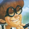
Hey where is this fit Whit being discussed? I'd like to see this man! 
That is one thing I always hated with the art style when it was changed... Whit went from HARRISON FORD WITH MUSTACHE to some fat old man who should be in a nursing home!
That is one thing I always hated with the art style when it was changed... Whit went from HARRISON FORD WITH MUSTACHE to some fat old man who should be in a nursing home!


-
Eugene

- Official Brainiac

- Posts: 1416
- Joined: June 2009
- Location: Occupied lands of Canada
- Status: My hair is 🟣; My soul is ☠
- Gender:
- Contact:
My general rating of the new design? 3.99 out of 5. While I think that the new design looks great for the most part, there are some aspects (such as the logo) that don't quite feel/look right (especially compared to the current one). I think that they should have at least kept the 'Odyssey' part of the logo the same. It also needs to be less... contained(?) in the frame. It's good, and I do like it, but it's too different. It just looses its "adventure-ish edge".
What I think (and hope) that Focus is going to do is finish re-packaging the albums with the same current design, and then use the new logo, frames, layout, and art styles for all albums that follow the 50th. This is the only answer that makes sense to me. 'Cause why would they spend more money on re-packaging the re-packaged albums? I am all for the new style and layout if this is how they will implement it. And even if they don't do this, I still like it.
And this new Whit looks more like how I imagined him. Except that his face needs to be more like the current illustrations depict. But their illustration of Wooton is nothing like what I imagined him to look like.
The Top Crusader wrote:Hey where is this fit Whit being discussed? I'd like to see this man!


"Don't fuss with me." WHY;
-
The Top Crusader
- Hammer Bro
- Posts: 22635
- Joined: April 2005
- Location: A drawbridge over a lava pit with an axe conveniently off to the side
Oh, nevermind, I don't like him anymore. 
But thanks for the picture!
Its not awful but his head looks too big.
But thanks for the picture!
Its not awful but his head looks too big.
-
Trixie Belden

- Honourary Narnian

- Posts: 1803
- Joined: November 2009
- Location: In Owl City, on Tenth Avenue North
- Contact:
I think that the logo is fine, but that's about it. To be succinct, it's BORING! It's got no personality anymore. It's okay, but I liked the old one better.

-
Jacob Isom

- I'm not Gabe
- Posts: 672
- Joined: April 2005
- Location: Ohio
- Contact:
That is correct. The new cover and layout will be implemented for all albums 51+.The old logo and art style will be used for all the 1-50 repacks.Eugene wrote:What I think (and hope) that Focus is going to do is finish re-packaging the albums with the same current design, and then use the new logo, frames, layout, and art styles for all albums that follow the 50th.
And can anyone see what those episode titles are? It's too blurry to tell on some of them.

"Providing the Scoop on Adventures in Odyssey, one cone at a time."
http://www.odysseyscoop.com | Personal Site: http://www.jacobisom.org

I also don't like the new logo...it looks too fake for me.
"I still see Marvin as a newbie that is just as cool as an oldie." --snubs
Most Sarcastic Poster | Most Likely To Be Eaten By a Dinosaur and Smote by God |
Biggest Joker and Grammar Nazi | Best Writer
Most Sarcastic Poster | Most Likely To Be Eaten By a Dinosaur and Smote by God |
Biggest Joker and Grammar Nazi | Best Writer

trent and i both came up with the list seen here http://aiowiki.com/wiki/Album_51:_Take_It_From_The_TopJacob Isom wrote:That is correct. The new cover and layout will be implemented for all albums 51+.The old logo and art style will be used for all the 1-50 repacks.Eugene wrote:What I think (and hope) that Focus is going to do is finish re-packaging the albums with the same current design, and then use the new logo, frames, layout, and art styles for all albums that follow the 50th.
And can anyone see what those episode titles are? It's too blurry to tell on some of them.
Reddo
aiowiki - we have a lot of info, check us out sometime
aiowiki - we have a lot of info, check us out sometime
-
Jacob Isom
- I'm not Gabe
- Posts: 672
- Joined: April 2005
- Location: Ohio
- Contact:
hehe -- I updated all the Scoop's episode info and 51 stuff. It's nice to finally have some closure to the open-endedness.
-- Fri Jan 15, 2010 1:13 pm --
I wrote a new article at the Odyssey Scoop regarding the new AIO logo. Everyone read it!
http://www.odysseyscoop.com
-- Fri Jan 15, 2010 1:13 pm --
I wrote a new article at the Odyssey Scoop regarding the new AIO logo. Everyone read it!
http://www.odysseyscoop.com
"Providing the Scoop on Adventures in Odyssey, one cone at a time."
http://www.odysseyscoop.com | Personal Site: http://www.jacobisom.org